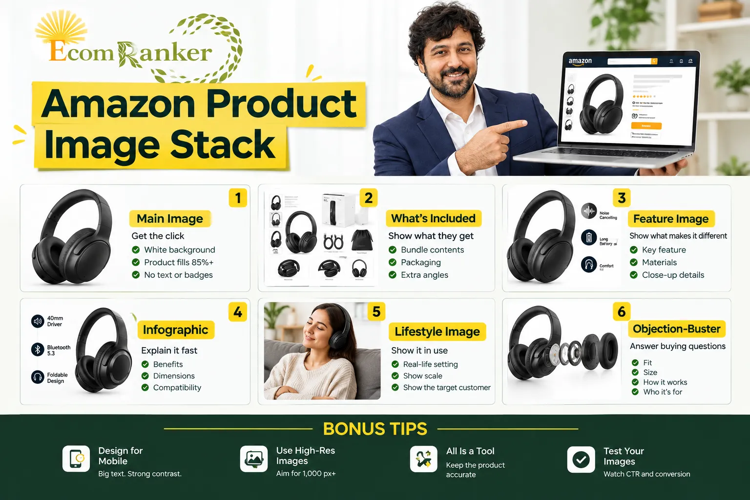

On Amazon, shoppers cannot touch, hold, or try your product. Your images do that job for them. Before a shopper reads one word of your title or bullets, they have already judged your product by its main image in search results, and most of them will decide to buy, or bounce, after swiping through the image carousel on their phone.
This guide explains the Amazon product image stack: the planned sequence of listing images where every slot has one job. We break down each image type, every rule and best practice behind it, how A+ Content and your Brand Store continue the story below the fold, and how to test what you publish. If you would rather have specialists build it for you, our Amazon listing image design services team does exactly this for brands in the US, UK, UAE and India.
Key takeaways
- Your main image wins or loses the click; secondary images win or lose the sale.
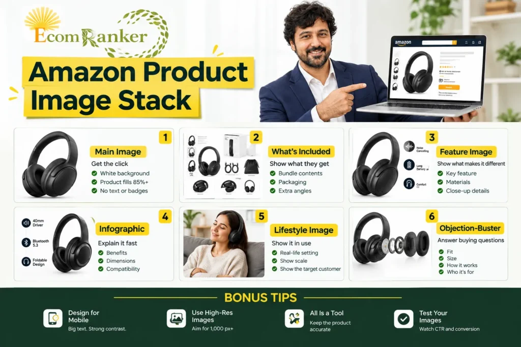
- Plan images as a stack: Main, What’s Included, Feature, Infographic, Lifestyle, Objection-Buster, plus video.
- Main image rules are strict: pure white background, product filling 85% or more of the frame, and no text, logos or badges.
- Upload at 1,000 px or larger on the longest side so zoom works; 2,000 px gives sharper zoom.
- Design for mobile first: big text, strong contrast, one message per image.
- A+ Content can lift sales by up to 8% (Basic) and up to 20% (Premium), according to Amazon.
- Test with Amazon’s Manage Your Experiments and track CTR and conversion rate, not opinions.
What Is an Amazon Product Image Stack?
An Amazon product image stack is the ordered set of images (and video) on a product detail page, designed so that each image answers a specific shopper question in the order shoppers ask it. Instead of uploading seven nice-looking photos, you assign each slot a job: get the click, show what is in the box, prove what makes the product different, explain benefits fast, show it in real life, and remove the last doubts before purchase.
Think of it as a silent sales conversation. A good salesperson greets the customer, shows the product, demonstrates the key feature, explains why it beats alternatives, and handles objections. Your image stack does the same thing in about 30 seconds of swiping, and it works for every shopper, 24 hours a day.
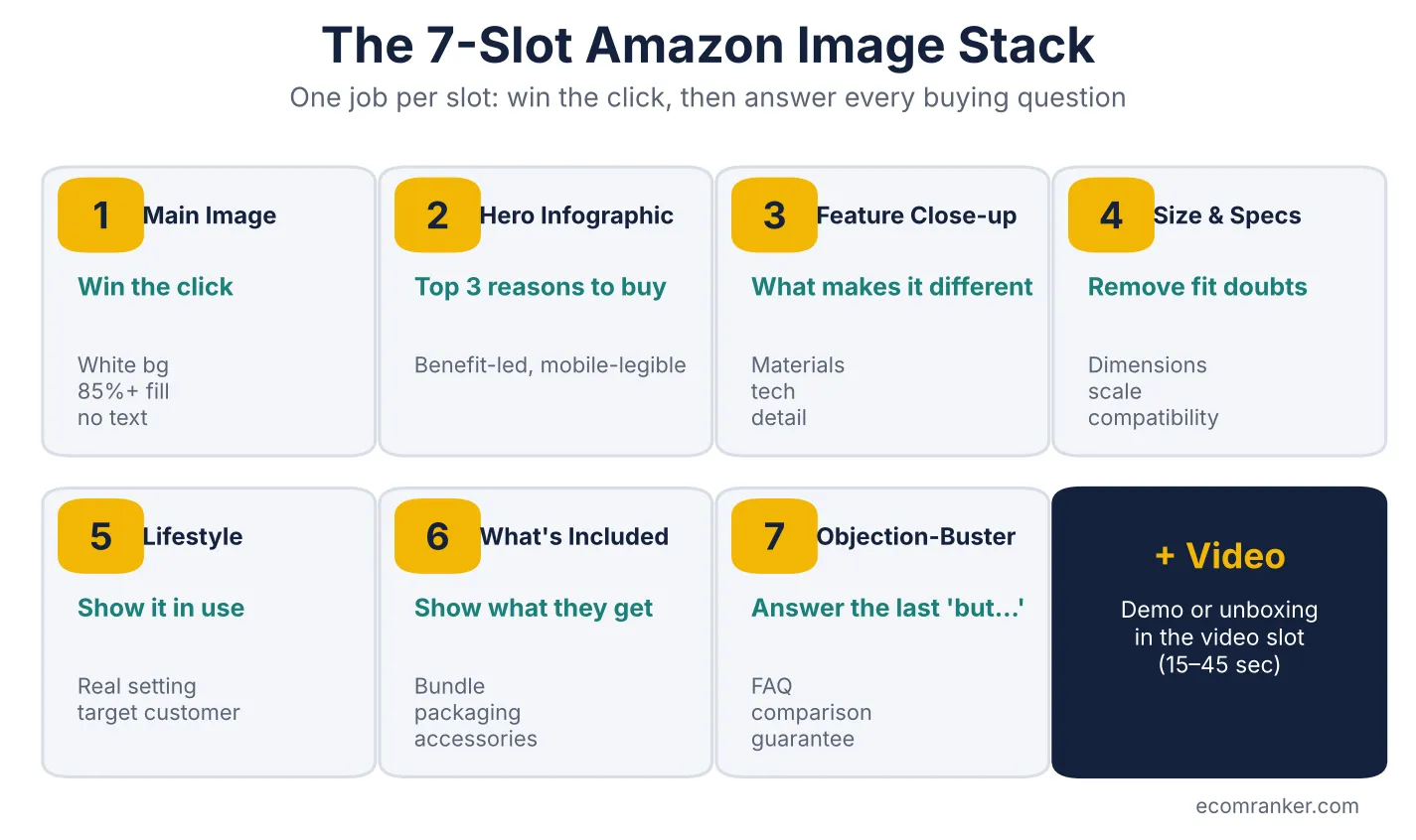
Figure 1: The 7-slot Amazon image stack. Each slot has one job.
Why Product Images Decide Your Amazon Conversion Rate
Images influence two metrics that drive almost everything else on Amazon: click-through rate (CTR) from search results and unit session percentage (conversion rate) on the detail page. Both feed Amazon’s ranking algorithm. A listing that earns more clicks and converts more of those clicks sells more, which improves organic rank, which brings more traffic. That is why image work is one of the highest-leverage parts of Amazon listing optimization.
Images also directly affect advertising cost. When your listing converts better, every click you pay for produces more sales, which lowers ACoS and TACoS. Many brands try to fix rising ad costs with bid changes when the real problem is a detail page that does not convince shoppers. Strong images make your Amazon PPC management work harder for the same budget.
Finally, accurate images reduce returns and negative reviews. When shoppers can see the true size, contents and use of a product before buying, fewer orders come back as “not as described”.
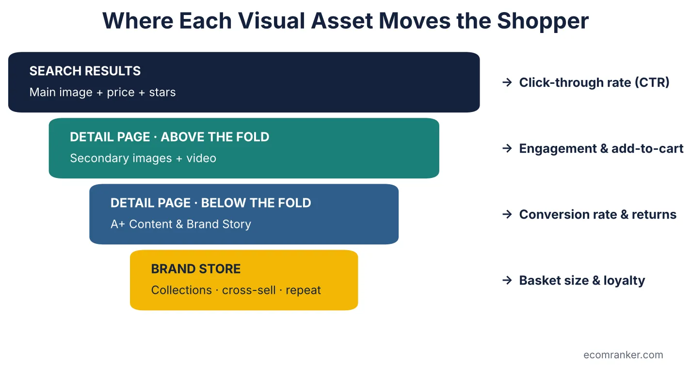
Figure 2: Each visual asset moves shoppers through a different stage of the Amazon funnel.
Amazon Product Image Requirements You Must Follow
Before you plan creative, make sure every file meets Amazon’s technical rules. Non-compliant images can be suppressed, which removes your listing from search until it is fixed.
| Requirement | Main image | Secondary images |
| Background | Pure white (RGB 255, 255, 255) | Any background; lifestyle scenes allowed |
| Product fill | Product fills 85% or more of the frame | No minimum |
| Text, logos, badges | Not allowed | Allowed (infographics, callouts) |
| Minimum size | 1,000 px on the longest side for zoom | 500 px minimum; 1,000 px+ recommended |
| Recommended size | 2,000 px+ on the longest side | 2,000 px+ for crisp zoom |
| File formats | JPEG (preferred), PNG, TIFF, non-animated GIF | Same |
| What to show | Only the product being sold, fully in frame | Angles, details, use, contents, comparisons |
Some categories (such as apparel, jewellery and shoes) have additional rules, so always check the category style guide in Seller Central before shooting.
The Amazon Image Stack Explained, Slot by Slot
Below is each slot in the stack, its job, and every checklist point explained in plain language, with the mistakes we see most often when auditing listings.
Image 1: Main Image (Job: Get the Click)
The main image is the only image shoppers see in search results, sponsored ad placements and most mobile views. It sits next to your price, star rating and review count, and it has a fraction of a second to earn the click. It is also the most tightly regulated image on Amazon.
White background
Amazon requires a pure white background (RGB 255, 255, 255) for the main image. “Almost white”, light grey or a soft gradient can trigger suppression and also looks dull next to compliant competitors. Shoot on white or use clean background removal, then check the corners with a colour picker. A true white background also makes your product look crisp in a grid of competitors and keeps your listing eligible for every placement.
Product fills 85% or more of the frame
The product should occupy at least 85% of the image area. Search result thumbnails are tiny, especially on phones, so a product floating in empty white space looks small and cheap. Crop tight, angle the product to show its best side (a three-quarter angle usually shows more shape than a flat front view), and make sure the full product is visible with no part cut off. This single change is often the fastest CTR win we find in audits.
No text or badges
Main images cannot include text, logos added after the fact, watermarks, “Best Seller” style badges, borders or inset images. Shoppers already see your title, price and Prime badge beside the image. Adding claims to the main image breaks policy and risks suppression. Put your selling messages in secondary images and A+ Content instead, where they are allowed and work better.
Image 2: What’s Included (Job: Show What They Get)
Once a shopper clicks, the first question is often “what exactly arrives in the box?” Unclear contents are a leading cause of returns and “missing parts” reviews, so this image protects both conversion and seller metrics.
Bundle contents
Lay out every item the customer receives: the product, cables, adapters, cases, manuals, refills or spare parts. Label each item with a short name. If it is a multipack, show the exact quantity. For a virtual bundle on Amazon, make sure the image matches every component in the bundle.
Packaging
Show the retail box or gift packaging, especially for giftable products. Premium packaging signals quality and helps shoppers who are buying for someone else. It also helps customers recognise the parcel when it arrives, which reduces “wrong item” confusion.
Extra angles
Use spare space in this image (or the next) to show the back, side, top or folded view. Every angle you show answers a question a shopper would otherwise ask in Customer Questions, or worse, answer by buying from a competitor who showed it.
Image 3: Feature Image (Job: Show What Makes It Different)
Most categories on Amazon are crowded with similar-looking products. The feature image explains why yours is not the same as the cheaper option next to it. Focus on one hero feature rather than six small ones.
Key feature
Pick the single feature that most influences buying decisions in your category, such as noise cancellation for headphones, a leak-proof seal for bottles, or a non-toxic coating for cookware. Name it clearly in a short headline and visually demonstrate it with arrows, cutaways or before-and-after views.
Materials
Show and name what the product is made of: memory foam, stainless steel, solid wood, organic cotton. Materials justify price and quality, and shoppers often search for them directly (for example “stainless steel water bottle”), so matching visual and text cues helps the listing feel relevant.
Close-up details
Zoomed-in shots of stitching, texture, buttons, ports or finishes build trust that the product is well made. High-resolution close-ups are also what shoppers look for when they use Amazon’s zoom, so supply images large enough to reward that zoom.
Image 4: Infographic (Job: Explain It Fast)
Most Amazon shoppers skim. An infographic packs the core reasons to buy into one image that can be understood in a few seconds on a phone screen. The best infographics use three short benefit statements with icons and a clean product shot.
Benefits
Lead with outcomes, not specifications. “Up to 40 hours of battery” is a feature; “All-day listening without recharging” is the benefit. Write three benefit lines of five to seven words each, in large type, and support each with an icon or mini visual.
Dimensions
Add exact measurements in both metric and imperial units (cm and inches; g and oz) for buyers in the UK, US and other markets. Dimension lines drawn directly on the product are easier to understand than a specs table. Wrong-size purchases are one of the most avoidable reasons for returns.
Compatibility
If the product works with other items (devices, models, appliances, vehicle types or refills), list them clearly. Compatibility is a common deal-breaker question; answering it in the image stops shoppers leaving the page to check elsewhere.
Image 5: Lifestyle Image (Job: Show It in Use)
Lifestyle images help shoppers picture themselves owning the product. They create emotional desire, which spec-led images cannot do on their own.
Real-life setting
Show the product in the environment where it is actually used: a home office, a kitchen counter, a gym, a car interior, a nursery. Realistic settings feel more trustworthy than over-styled studio sets. Keep the product the clear hero of the scene.
Show scale
Lifestyle images naturally show size against hands, bodies, furniture and everyday objects. This complements the dimension infographic, because many shoppers understand “fits in a handbag” faster than “18 cm”.
Show the target customer
Cast models and scenes that match your actual buyer. If your buyers are new parents, students, tradespeople or fitness enthusiasts, show them. Shoppers respond to people who look like them, and it signals that the product is “for someone like me”.
Image 6: Objection-Buster (Job: Answer Buying Questions)
This is the image most sellers skip, and it is often the one that closes the sale. Read your reviews, Customer Questions and competitor 1-star reviews, list the most common doubts, and answer them visually.
Fit
Will it fit me, my device, my space or my car? Show the product on different body types, adjustable ranges, or the specific models it fits. For apparel and wearables, include a simple size guide.
Size
Compare the product to familiar objects or to competing sizes in your own range. If you sell several sizes, a side-by-side size comparison chart helps shoppers choose correctly and reduces returns.
How it works
Show setup or use in three or four numbered steps, such as power on, pair, play. This removes fear that the product is complicated, especially for electronics, kitchen gadgets and assembly products.
Who it’s for
Show the use cases and audiences the product suits: work, study, travel, gifting, beginners or professionals. This helps shoppers self-qualify and encourages gift buyers who are unsure.
Slot 7 and Video: Completing the Stack
If your category allows more images, use slot 7 for a comparison chart against your own range, a warranty or guarantee message, or social proof such as an award. Then add a product video of 15 to 45 seconds showing the product in use or an unboxing. Video helps shoppers who want to see movement, sound, texture or assembly before buying.
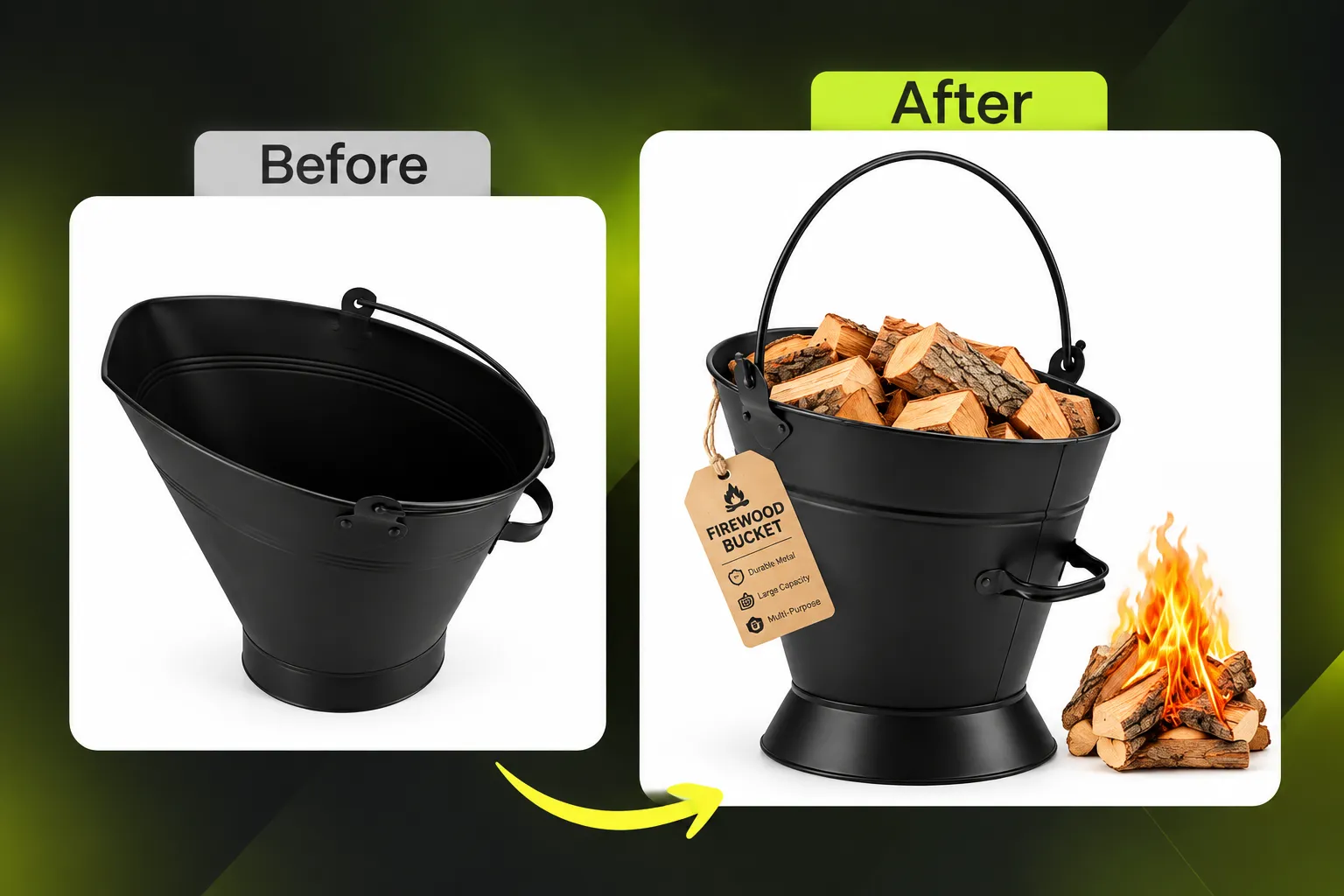
Bonus Tips for Amazon Images That Convert
Design for Mobile: Big Text, Strong Contrast
Most Amazon shopping now happens on phones, where your image is roughly the size of a playing card. Text that looks fine on a desktop monitor becomes unreadable. Use a minimum of three to four large words per line, bold sans-serif fonts, and high contrast between text and background (dark text on light, or the reverse). Preview every image at phone size before uploading. If you cannot read it on your own phone at arm’s length, shoppers cannot either.
Use High-Res Images: Aim for 1,000 px or More
Amazon only enables zoom when an image is at least 1,000 px on its longest side. Shoppers who zoom are inspecting quality, and they are close to buying. We recommend exporting at 2,000 px or larger as JPEG in sRGB, so close-ups stay sharp. Low-resolution or blurry images make even premium products look cheap.
AI Is a Tool: Keep the Product Accurate
AI image tools are useful for backgrounds, scene ideas, retouching and speeding up variations. But the product itself must always be shown exactly as the customer will receive it: true colour, shape, size, finish and included parts. AI-altered products that look better than reality lead to returns, negative reviews and possible policy issues. Use AI for the set, not to change the product.
Test Your Images: Watch CTR and Conversion
Image decisions should be made with data, not opinions. Brand-registered sellers can use Amazon Manage Your Experiments to A/B test main images, titles and A+ Content. Track search CTR in Brand Analytics and the Search Query Performance dashboard, and track unit session percentage in Business Reports. Change one variable at a time, let tests run until Amazon reports a result, and keep a log of what won.
Beyond the Image Carousel: A+ Content and Brand Store
Product images do most of the work above the fold. But shoppers who scroll down are high-intent buyers looking for more reasons to trust you. That is where A+ Content and your Brand Store take over.
Amazon A+ Content: Turning Interest into Purchase
A+ Content replaces the plain product description with rich visual modules: banner images, comparison charts, feature callouts and brand story. Amazon states that Basic A+ Content can increase sales by up to 8%, and well-built Premium A+ Content by up to 20%. A+ is available to brand owners enrolled in Amazon Brand Registry.
- Basic A+ Content: up to five standard modules per ASIN, including images, text, and comparison charts.
- Premium A+ Content: larger full-width visuals, video, interactive hotspots, carousels and Q&A modules. Eligibility requires a published Brand Story across your catalogue and at least 15 approved A+ projects in the past 12 months.
- Brand Story: a carousel above A+ that introduces your brand and links shoppers to other products and your Store.
Strong A+ Content follows the same logic as the image stack: lead with the hero benefit, explain features visually, include a comparison chart to cross-sell your range, and answer objections. A+ modules also contain image alt text, which gives you another place to use relevant keywords naturally. See our Amazon A+ Content design services for how we build Basic and Premium A+ that converts.
Amazon Brand Store: Your Brand’s Own Shop on Amazon
An Amazon Brand Store is a free, multi-page branded shop with its own URL, available to Brand Registry sellers. It is where shoppers browse your full range, discover bestsellers and bundles, and buy more than one item. It is also the best landing page for external traffic and Sponsored Brands ads, because there are no competitor products on the page.
Industry reporting citing Amazon data indicates that Stores updated within the last 90 days see around 13% higher attributed sales per visitor and more repeat visitors than stale Stores. Keep collections, seasonal banners and hero products fresh. Our Amazon Brand Store design services cover navigation, page layouts, shoppable images and seasonal refreshes.
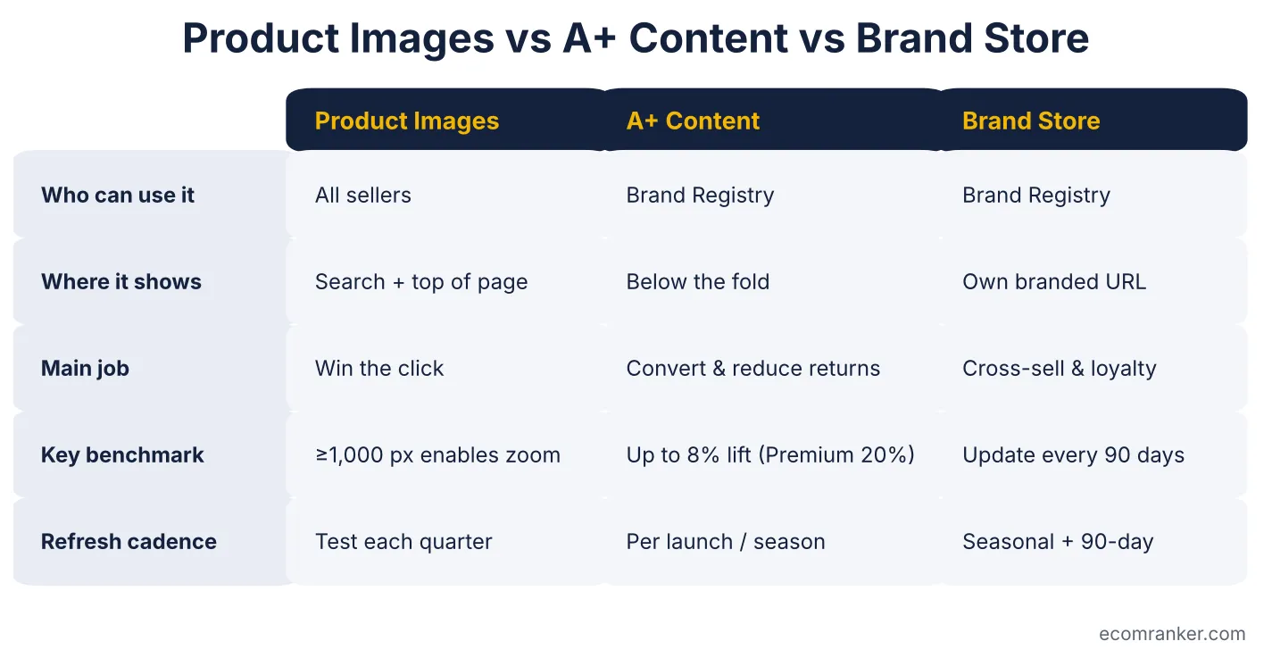
Figure 3: How product images, A+ Content and Brand Store work together.
Common Amazon Image Mistakes That Cost Sales
- Off-white or textured main image background, which risks suppression and looks dull.
- Product too small in the frame, so the thumbnail disappears in search results.
- Text-heavy infographics that cannot be read on a phone.
- Repeating the bullet points word for word instead of showing proof visually.
- No size reference, leading to wrong-size purchases and returns.
- Inconsistent style across variations, which makes the brand look untrustworthy.
- Editing the product itself with AI so it no longer matches what customers receive.
- Never testing, so poor images stay live for years.
How to Audit Your Amazon Listing Images in 15 Minutes
- Search your main keyword on your phone. Does your main image stand out among the first 10 results?
- Check the main image: pure white, 85%+ fill, no text, at least 1,000 px.
- Swipe through every image at phone size. Can you read every word?
- Does every slot have a different job, or do several images repeat the same message?
- Is there a clear dimension image and a what’s-included image?
- Read your last 50 reviews and Customer Questions. Is every recurring question answered visually?
- Check A+ Content: is there a comparison chart linking to your other ASINs?
- Check your Brand Store: has it been updated in the last 90 days?
- Compare your CTR and conversion rate with the category average in Brand Analytics.
If your listing fails more than two of these checks, it is likely leaving sales on the table. You can request a free Amazon listing audit from our team and we will send back a prioritised list of fixes.
Results: What Better Visuals Look Like in Practice
Drift Scents: Car and Home Fragrance
When EcomRanker took over the Drift Scents account in 2024, we rebuilt the catalogue, Brand Store and A+ Content, and created an emotion-led, luxury brand story for the A+ modules. We also merged 30+ scent variants into a single listing, which cut ad costs and raised return on ad spend. Category market share grew from around 1 to 2% to 20 to 25%, and the business has grown roughly 100x since we started. Read the full Drift Scents Amazon case study.
EAI Hardware: UK Cabinet and Door Hardware
EAI Hardware came to us with high advertising costs and a messy, overlapping catalogue. Alongside catalogue clean-up and PPC restructuring, we built A+ Content product comparison charts to drive traffic to every product in the range and increase basket value. In the first year, sales rose 55% and ACoS fell by 9 percentage points. Read the EAI Hardware Amazon case study.
EcomRanker’s Amazon Image, A+ Content and Brand Store Services
EcomRanker is a full-service Amazon agency founded in 2017, working with brands in the US, UK, UAE and India. Our creative team plans visuals around conversion data, not just aesthetics, and works hand in hand with our PPC and SEO specialists.
| Service | What’s included | Best for |
| Amazon product image design | Image stack strategy, main image retouching, infographics, lifestyle, what’s-included and objection-buster images, mobile-first layouts | New launches and listings with low CTR or conversion |
| Premium A+ Content | Copy, design and upload of Basic or Premium A+ modules, comparison charts, Brand Story. From $35 per page | Brand-registered sellers wanting higher conversion and fewer returns |
| Amazon Brand Store design | Store architecture, page design, shoppable images, seasonal refreshes | Brands with 5+ ASINs, Sponsored Brands advertisers |
| Image A/B testing | Manage Your Experiments setup, test plans, reporting | Established listings with steady traffic |
| Full account management | Images and A+ plus SEO, PPC, inventory and catalogue. Monthly retainer, with a commission option after 3 months | Brands wanting one team to own growth |
Ready to improve your conversion rate? Book a free Amazon listing audit or contact EcomRanker to get a quote for product images, A+ Content or a Brand Store.
Frequently Asked Questions About Amazon Product Images, A+ Content and Brand Stores
What is an Amazon product image stack?
How many images can I upload to an Amazon listing?
What are Amazon's main image requirements?
What is the best image size for Amazon?
Which file formats does Amazon accept for product images?
Can I put text or a logo on my Amazon main image?
What order should Amazon listing images be in?
Do better images really increase Amazon sales?
Why is my Amazon listing getting clicks but no sales?
Why is my Amazon click-through rate low?
Can images reduce returns on Amazon?
How do I test which Amazon image converts better?
How often should I update my Amazon product images?
Can I use AI-generated images on Amazon?
What is Amazon A+ Content?
Conclusion: Treat Every Image as a Salesperson
The best Amazon listings are not built from random photos. They are built from a planned image stack where every slot answers the next question a shopper has, followed by A+ Content that deepens trust and a Brand Store that turns one purchase into several. Get the main image rules right, give every secondary image a single job, design for the phone in your customer’s hand, and test everything.
If you want a team that has done this across hundreds of ASINs, talk to EcomRanker’s Amazon creative team today.