

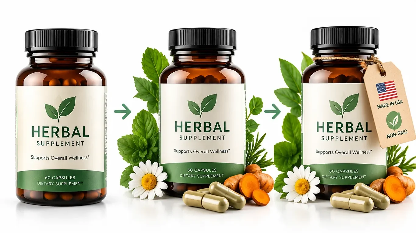
A main image redesign for a supplement product — three versions, same bottle, three completely different first impressions — shows exactly how much conversion is decided before a shopper reads a single word of copy. But one version in that redesign process crossed a real compliance line that’s easy to miss: Amazon’s main image rules are stricter than most sellers realize, and getting this wrong doesn’t just underperform, it can get a listing suppressed. Here’s the full breakdown, done the compliant way.
Key Takeaways
- The main image is the single highest-leverage asset on an Amazon listing — it’s the first, and often only, element a shopper evaluates before deciding whether to click at all, both in search results and in visual search contexts.
- A genuine redesign process — from a plain product shot to a context-rich, objection-handling image — can meaningfully change conversion, but the specific techniques used matter enormously for compliance.
- Amazon’s main image policy is strict and getting stricter: no added text, logos, badges, watermarks, or props that aren’t literally part of the physical product as shipped — a rule enforced increasingly by AI scanning systems rolled out through 2025 and 2026.
- A trust-signal element like a “Made in USA” tag can absolutely be part of a winning image strategy — it just belongs on a secondary image or in A+ Content, not layered onto the main image, unless it’s a genuine physical component that ships with every single unit.
- The psychology behind an effective main image redesign is sound and worth applying — the compliance boundary is about where certain elements go, not whether visual storytelling and trust-signaling work as conversion levers.
Why the Main Image Carries This Much Weight
Before getting into the redesign process itself, it’s worth being precise about why this single image matters as much as it does. On Amazon, the main image is doing several jobs simultaneously that no other part of a listing can do:
It’s the primary input to the click decision.
In both organic and sponsored search results, the main image is the largest, most visually dominant element on the results page — larger than the title, more immediately processed than the price, and evaluated by a shopper in a fraction of a second before they’ve read anything at all. A shopper scanning a results page isn’t reading titles first; they’re pattern-matching on images first, and only reading the title of whichever image already caught their attention.
It sets the frame for everything that follows.
Once a shopper clicks through to the product page, the main image is still the first thing rendered, and it anchors how they interpret every subsequent image, bullet point, and review. A main image that undersells the product creates a credibility gap the rest of the listing then has to work to close; a main image that’s already doing real communicative work gives everything after it a head start.
It’s increasingly a data input, not just a display asset.
As covered in more depth in our Amazon Lens Live guide, Amazon’s visual search and AI shopping systems increasingly process image content directly — meaning the main image isn’t purely a human-facing conversion asset anymore. What’s in that image, and how clearly it represents the product, has a discoverability dimension that didn’t exist in the same way even a few years ago.
It’s the single most heavily regulated image in the entire listing.
This last point is the one most sellers underweight, and it’s the one this article spends real time on, because getting it wrong has a downside most sellers don’t fully appreciate until it happens to them: a suppressed listing, with sales halted immediately, sometimes without much warning.
Given all four of these roles stacked on one image, treating a main image as a “set it once at launch and forget it” asset is a mistake. The case study below walks through what a deliberate redesign process actually looks like — including the point where the original approach needed a course-correction.
The Case Study: Three Versions, One Product
This case study is based on a real internal redesign project for a supplement product — specifically, a bottle of capsules formulated around a botanical/herbal ingredient profile. The goal wasn’t a cosmetic refresh; it was a deliberate attempt to find out how much a main image could be improved through better communication design, without touching the underlying product at all.
Version 1 — The Safe Version
The starting point was what most sellers would consider a perfectly compliant, perfectly unremarkable main image: a clean shot of the bottle, soft shadow beneath it for depth, pure white background, centered composition. Technically, there was nothing wrong with this image — it met every stated requirement, rendered cleanly at thumbnail size, and represented the product accurately.
The problem wasn’t compliance. The problem was that “compliant” and “compelling” are two entirely different bars, and Version 1 only cleared the first one. Scrolling through a results page full of supplement bottles on white backgrounds, this image didn’t do anything to interrupt that scroll. It looked like every other bottle in the category, which meant it was invisible in exactly the moment it needed to stand out.
Version 2 — Adding Context
The second version kept the same product, the same white background, and the same overall compliance posture — but added real, physical botanical elements from the product’s own formula, along with a few capsules placed in front of the bottle, visible and identifiable.
This is a genuinely different image, communicating something Version 1 couldn’t: before a shopper reads a single word of the title or bullets, this image already signals “herbal,” “natural,” and “purposeful.” It’s doing narrative work through composition and content alone. And critically, this addition is compliant — the botanical elements and capsules are real, physical components connected to the actual product (not printed graphics or overlays), shown accurately and without misrepresenting what the customer receives.
This is the version of the redesign process most sellers stop at, and reasonably so — it’s a genuine improvement over Version 1, achieved entirely through compliant means. Real elements, real product, better storytelling.
Version 3 — Where the Original Approach Needed a Correction
The original next step in this redesign process was to add a small hang-tag, styled to look tied to the neck of the bottle like a physical retail detail, reading “Made in USA” and “Non-GMO” — a visual attempt to preemptively answer two objections a supplement shopper commonly has before they even open the listing.
This is where the process needs a direct correction, and it’s worth explaining exactly why, since the underlying instinct here is genuinely good even though the execution crosses a real line.
Amazon’s main image policy — confirmed consistently across current 2026 documentation — prohibits any text, graphic element, badge, or prop on the main image unless it is a literal, physical part of the product as it ships to every customer. A styled hang-tag added during a photography or editing process, even if it’s designed to look physically attached rather than digitally overlaid, is treated the same way as a text overlay by Amazon’s review systems: it’s an added graphic element that isn’t a genuine, physical component of the product itself. Unless the actual bottle ships with a genuine printed hang-tag attached to every unit sold — a real product feature, not a photography technique — this element doesn’t belong on the main image.
This matters beyond a technicality. Amazon has rolled out AI-based image scanning with meaningfully improved detection accuracy through 2025 and into 2026 specifically to catch exactly this kind of addition — text and graphic elements added to main images — and enforcement has become faster and more consistent as a direct result. A listing that includes a compliant Version 1 or Version 2 style main image is safe. A listing using the styled hang-tag version, however well-intentioned, is now genuinely at risk of automated suppression, not because the tactic doesn’t work psychologically, but because it violates a specific, actively-enforced rule.
The lesson from this stage of the redesign isn’t “trust signals don’t work” — they clearly do, and the instinct to answer a shopper’s unstated objection before they even open the listing is exactly right. The lesson is that where that trust signal lives matters as much as whether it exists at all. The corrected version of this idea — and a fully compliant Version 3 — is covered later in this article, once the compliance framework itself is laid out clearly.
The Line Between Context and a Compliance Violation
The distinction that separates Version 2 (compliant, effective) from the original Version 3 concept (effective, non-compliant) comes down to one question: is the added element a genuine, physical part of the product as shipped, or is it something introduced specifically for the photograph?
- Genuinely physical and shipped with every unit → generally acceptable on the main image, since it’s accurately representing what the customer receives (real botanical ingredients placed near the product, the product’s actual packaging if packaging is a key selling feature in specific categories like beauty, a genuine label design that’s printed on the product itself)
- Added specifically for the photograph, not physically part of every shipped unit → not acceptable on the main image, regardless of how “real” or “physical” it’s styled to look (a hang-tag not actually attached to the product, a badge graphic, explanatory text, a comparison callout, a lifestyle prop not included in the purchase)
This distinction resolves a genuinely common point of confusion. Sellers frequently assume that because an element looks physical — styled with realistic shadows, tied at a realistic angle, printed to look like real card stock — it somehow clears the bar differently than a flat digital overlay would. It doesn’t. Amazon’s rule isn’t about how convincingly an element is rendered; it’s about whether that element is actually, physically part of what ships to the customer. A beautifully-rendered fake hang-tag and a crude text overlay are treated identically by both the written policy and, increasingly, by the AI systems enforcing it.
What’s Actually Allowed on Your Main Image (2026 Rules, by Category)
The core rules are broadly consistent across categories, with some category-specific nuances worth knowing:
| Category | Core Rule | Category-Specific Notes |
| General / most categories | Pure white background (RGB 255,255,255), product fills 85%+ of frame, no text/logos/props/badges | Baseline rule most other categories build on |
| Supplements / Health & Personal Care | Same baseline; packaging can appear if it’s a genuine selling feature | A physically-shipped hang-tag or printed claim on the actual bottle/box is fine; a photography-added one is not |
| Electronics | Product only, no props that could imply included accessories | Especially strict about implying bundled items that aren’t included |
| Apparel | Human models permitted, must be standing, minimal styling | Ghost mannequin or standard flat-lay also accepted |
| Jewelry | Pure white, flat shot, full product visible (necklaces may crop at frame edge) | No packaging or gift boxes unless the box is explicitly part of the purchase; no models in the main image (secondary images only) |
| Books | Front cover only, filling the frame | No added text or badges beyond the cover’s own printed design |
| Footwear | No pairs shown together (single shoe/view only, unless sold as a set), no overlays | Static size charts are increasingly auto-generated by Amazon rather than seller-uploaded |
Universal prohibitions across essentially every category:
star ratings or review quotes, “Best Seller” or “Amazon’s Choice” style badges, discount or promotional callouts, warranty or shipping claims, watermarks or brand logos layered on top of the image, and any text or graphic element covering a meaningful share of the frame. Several current sources note a 2026-specific enforcement detail worth flagging directly: text or graphic overlays covering more than roughly 20% of the total image area are now being specifically flagged under newer detection rules, on top of the long-standing “no overlays at all” baseline — reinforcing that this is an area of active, tightening enforcement, not a static rule set.
What Amazon’s AI Scanning Actually Catches
This deserves its own section because it changes the practical risk calculation for sellers who might otherwise assume a rule is loosely enforced. Amazon transitioned from periodic manual review to continuous, automated scanning of product images starting around 2025, with detection accuracy for text specifically described as significantly improved heading into 2026. The practical implications:
- Detection is largely automatic and fast, not dependent on a human reviewer happening to notice a violation — a non-compliant main image is meaningfully more likely to be caught, and caught quickly, than it would have been in earlier years
- Text detection specifically has improved substantially — a styled hang-tag, a subtle watermark, or a small badge that might have gone unnoticed under older manual review processes is exactly the kind of element current systems are tuned to catch
- Consequences escalate with repetition — a first violation commonly results in listing suppression; a pattern of repeated violations can contribute to broader account-level scrutiny and, in more serious cases, suspension risk
- New brands and newer product categories are seeing stricter enforcement specifically — several 2026 sources note this pattern directly, suggesting new listings may be scrutinized somewhat more closely than established ones with a clean history, though the underlying rules apply to every seller
The practical takeaway: whatever main image strategy a brand pursues, it needs to be built assuming automated, near-immediate review, not the more forgiving, inconsistent enforcement environment many sellers still mentally operate under from a few years ago.
The Psychology of a Three-Second Decision
Setting the compliance question aside for a moment, it’s worth understanding why the underlying redesign instinct — moving from Version 1 to Version 2 — actually works, since the psychology here is sound and directly informs how to build a compliant Version 3.
A shopper scanning a search results page is making a rapid pattern-recognition judgment, not a considered evaluation. In that window, three things happen almost simultaneously: the shopper identifies whether the image matches what they’re looking for at all, forms an instant impression of quality and trustworthiness, and decides whether anything about the image is different enough from the surrounding results to warrant a closer look. A plain white-background product shot, however technically correct, gives the shopper nothing to differentiate on beyond the product’s own inherent visual distinctiveness — which for most categories, especially commodity-adjacent ones like supplements, phone accessories, or kitchen tools, isn’t much.
Adding genuine context — real ingredients, the product in a relevant setting, a detail that signals category (herbal elements signaling “natural supplement” before any text is read) — gives the shopper’s rapid pattern-matching process something specific to latch onto. This isn’t decoration; it’s compressed communication, conveying in a fraction of a second what would otherwise require the shopper to read and process actual words. That’s the real mechanism behind why Version 2 outperforms Version 1, and it’s the same mechanism a compliant trust-signal strategy needs to tap into — just executed in the right location.
The Four-Question Audit Framework
Before finalizing any main image, run it through a specific, disciplined set of questions rather than relying on a general “does this look good” impression:
1. Does it still read clearly at thumbnail size?
Most shoppers first encounter this image at a genuinely small size, often on a mobile screen. Test the actual thumbnail rendering, not just the full-size version — details that read clearly at full resolution can disappear or blur together at the size most shoppers will actually see first.
2. Does it answer an objection, not just look pretty?
A main image with strong aesthetic quality but no functional communication is wasted opportunity. Ask specifically: what’s the most common hesitation a shopper in this category has, and does this image address any part of it, compliantly, before the shopper even opens the listing?
3. Would you click on this over a competitor’s white-background-only shot?
This is a genuinely useful gut-check, run against real competitor listings in the same search results, not in isolation. If the honest answer is “not really,” the image likely needs another iteration.
4. Are you adding elements because they help, or because they fill space?
Every element in a main image — even a compliant one — should be doing specific communicative work. An element added purely because the composition felt sparse, without a clear purpose, tends to add visual noise rather than genuine differentiation, and can also push toward the compliance risk zone discussed above if it starts to look like an added graphic rather than an organic part of a real product photo.
Where Trust Signals Actually Belong: Secondary Images and A+ Content
This is the direct answer to the compliance problem raised earlier: trust signals, certifications, and explanatory callouts are entirely legitimate, effective tools — they just need to live in the parts of the listing built for exactly this purpose.
| Trust Signal Type | Compliant Placement | Why It Works There |
| “Made in USA,” “Non-GMO,” certification badges | Secondary image (slots 2-9) as an infographic-style callout | Secondary images explicitly permit text and graphics, provided the product still occupies a meaningful share of the frame |
| Size/scale reference | Secondary image with a hand model or familiar object | The single most effective reducer of size-related returns, and explicitly permitted only outside the main image |
| Comparison vs. competitors | Secondary image, structured comparison chart | Allowed as long as claims are accurate and not misleading |
| Ingredient/material detail close-ups | Secondary images | Builds trust and justifies pricing without any main-image compliance risk |
| Full certification and claim detail | A+ Content (for Brand Registered sellers) | The dedicated space for a fuller trust and credibility narrative, with far more layout flexibility than any single image |
The practical implication for the case study above: the “Made in USA / Non-GMO” hang-tag concept doesn’t need to be abandoned — it needs to move. As a secondary image (commonly slot 2 or 3, immediately after the main image and the in-context shot), styled as a clean infographic-style callout rather than a fake-physical tag, it accomplishes the exact same objection-handling goal the original concept was reaching for, fully compliantly, and arguably more clearly, since a dedicated secondary image can present this claim with more visual space and clarity than trying to fit it onto a busy main image ever could.
A Compliant Version of “Version 3”
Putting this together, here’s what the actually-recommended final version of this redesign looks like:
- Main image: Version 2 as described above — the bottle with real, physical botanical elements and visible capsules, on a pure white background, no added text or graphics. This is the image that appears in search results and anchors the listing.
- Secondary image (slot 2): A lifestyle or in-context shot showing the product in a realistic use setting.
- Secondary image (slot 3): The trust-signal infographic — a clean, well-designed callout communicating “Made in USA” and “Non-GMO,” along with any other genuine, verifiable claims relevant to the product, using Amazon’s permitted infographic format (product still visible and prominent, text and graphics supplementing rather than replacing the product image).
- Secondary image (slot 4 or 5): A size/scale reference or detail close-up, depending on which specific objection matters most for this product category.
This sequence accomplishes everything the original three-version concept was trying to do — progressively answering more of the shopper’s questions and objections as they move through the image gallery — without putting the listing at risk on the one image where Amazon’s enforcement is strictest and most automated.
How Main Images Connect to Visual Search and AI Shopping
As covered in more depth in our Amazon Lens Live guide, Amazon’s visual search systems increasingly interpret image content directly, including reading text that appears within an image. This adds a layer of relevance to the compliance discussion above that’s easy to miss: a main image kept clean and compliant, with real product detail rather than added text, is also the version that’s easiest for AI-driven visual matching systems to interpret accurately. A cluttered or non-compliant main image doesn’t just risk a policy violation — it can also perform worse in exactly the kind of AI-driven discovery context that’s becoming a larger share of how shoppers find products in the first place.
The Redesign Process, Step by Step
- Audit the current main image honestly against the four-question framework above — don’t assume it’s fine just because it’s technically compliant.
- Identify the single biggest missed opportunity: is the image failing to communicate category or use case (a Version 1 → Version 2 problem), or is it failing to address a specific known objection (the trust-signal problem)?
- Solve the category/context problem first, on the main image, using genuine, physical product elements — real ingredients, the actual product in a natural arrangement — never added graphics.
- Solve the objection-handling problem second, on secondary images, building a dedicated, well-designed infographic slot for each major objection rather than trying to cram everything into one image.
- Test the full sequence at thumbnail and mobile size before finalizing, not just the main image in isolation — the whole gallery needs to work together.
- Launch and monitor — track click-through rate and conversion rate specifically around the change (see the measurement section below), not just overall sales, which can be affected by many other simultaneous factors.
Common Mistakes When Refreshing a Main Image
- Assuming a styled or realistic-looking added element is treated differently than a flat text overlay — it isn’t, under current policy and current AI detection
- Cramming trust signals into the main image instead of using the secondary image slots specifically built for that purpose
- Redesigning the main image in isolation without considering how it reads alongside the rest of the image gallery
- Skipping the thumbnail-size test, only reviewing the full-resolution version during the design process
- Changing the main image and several other listing elements simultaneously, making it impossible to isolate what actually drove any resulting change in performance
- Treating “technically compliant” as the finish line rather than the minimum starting bar, leaving real conversion potential unclaimed
Measuring Whether a Main Image Change Actually Worked
Pull click-through rate and conversion rate specifically for the affected ASIN before and after the change, isolating the main image as the only variable changed during the test window where possible. As covered in our Amazon Seller Central Reports That Matter guide, the Detail Page Sales and Traffic report is the right tool for this — a genuine improvement should show up as increased CTR from search results specifically, not just an overall sales bump that could be explained by pricing, seasonality, or advertising changes happening at the same time. Give any change a reasonable window (several weeks minimum) before drawing conclusions, since short-term fluctuation is normal and can mask or mimic a real trend.
When to Leave a Main Image Alone
Not every listing needs this level of redesign attention. A main image that’s already driving strong, consistent conversion relative to category benchmarks, on an established listing with a long positive review and sales history, carries real risk in an unnecessary redesign — changing a working asset introduces uncertainty without a clear problem to solve. This process is most valuable for underperforming listings, new launches still finding their footing, or established products where a specific, known objection (like the “Made in USA” example here) has never actually been addressed anywhere in the image gallery.
How EcomRanker Approaches Main Image Strategy
We treat main image design as a compliance-first discipline that still leaves real room for genuine differentiation — building the category-and-context work into the main image using compliant, physical product elements, then handling every trust signal, certification, and objection through the secondary image gallery and A+ Content built specifically for that purpose. This connects directly to our broader Product Photography Guide and Positioning Strategy work, since the objections a main image redesign addresses should match the competitive claims the rest of the listing is built around.
Want your current main image audited against both the four-question framework and current compliance rules before you invest in a redesign? Get in touch for a listing image review.
Frequently Asked Questions
Can I add a “Made in USA” or certification badge to my Amazon main image?
Only if it’s a genuine, physical element that ships with every unit — a printed claim on the actual product or packaging. A tag or badge added specifically for the photograph, even styled to look physically attached, is not compliant with Amazon’s main image policy and risks listing suppression.
Why does a styled, realistic-looking hang-tag get treated the same as a flat text overlay?
Because Amazon’s rule is about whether the element is genuinely, physically part of the shipped product, not how convincingly it’s rendered. Both a beautifully-styled fake tag and a crude digital overlay are added graphic elements that aren’t part of the actual product, and both violate the same rule.
Where should trust signals and certifications go instead?
Secondary images (slots 2 through 9) or A+ Content for Brand Registered sellers. These sections explicitly permit text and graphics, provided the product remains prominently visible, making them the correct home for exactly this kind of content.
Does Amazon actually catch main image violations, or is enforcement inconsistent?
Enforcement has become significantly more consistent and automated. Amazon rolled out AI-based image scanning with improved text-detection accuracy through 2025 and 2026, meaning violations are caught faster and more reliably than in earlier years.
What happens if my main image gets flagged for a violation?
Common consequences include immediate listing suppression, halting sales on that ASIN. Repeated violations can contribute to broader account-level scrutiny and, in more serious cases, suspension risk.
Can I show my product’s packaging in the main image?
It depends on the category. For some categories, like beauty and health products, packaging can appear if it’s a genuine, key selling feature. For others, including electronics and jewelry, packaging generally shouldn’t appear in the main image unless the box itself is an explicit part of what’s being sold.
How much of the main image frame does the product need to fill?
Current guidance calls for the product to fill at least 85% of the image frame, avoiding a small product surrounded by excessive white space.
Can I use props in my main image?
Only if the prop is included in the purchase or is a genuine part of the product as shipped. Props included purely to enhance the photo, without being part of what the customer actually receives, aren’t permitted on the main image.
Is it true that new brands face stricter main image enforcement than established sellers?
Several current sources note this pattern specifically — newer brands and newer product categories appear to see somewhat closer scrutiny. The underlying rules apply universally, but new listings may be reviewed more carefully.
How do I test if my main image reads well at thumbnail size?
View the actual rendered thumbnail as it would appear in search results, not just the full-resolution file in an image editor — details that read clearly at full size can blur or disappear at the smaller size most shoppers see first.
Does a better main image actually improve my Amazon ranking?
Indirectly, yes. A stronger main image improves click-through rate and conversion rate, both of which are genuine ranking factors, meaning main image quality has an impact beyond the individual sale it directly influences.
Should I redesign my main image if sales are already strong?
Generally no, not without a specific, known problem to solve. Changing a main image that’s already performing well introduces risk without a clear upside, and is better reserved for underperforming listings or products with a known, unaddressed objection.
How long should I wait before judging whether a main image change worked?
Several weeks minimum, tracking click-through rate and conversion rate specifically for that ASIN, isolated from other simultaneous changes like pricing or advertising adjustments that could otherwise explain any shift in performance.
Does main image compliance affect how well my product performs in Amazon’s visual search (Lens Live)?
Indirectly, yes. A clean, compliant main image built around genuine product detail rather than added text tends to be easier for AI-driven visual matching systems to interpret accurately, connecting main image quality to discoverability beyond just human browsing.